Sequential Figure/Ground
Process Sketches
-
![]()
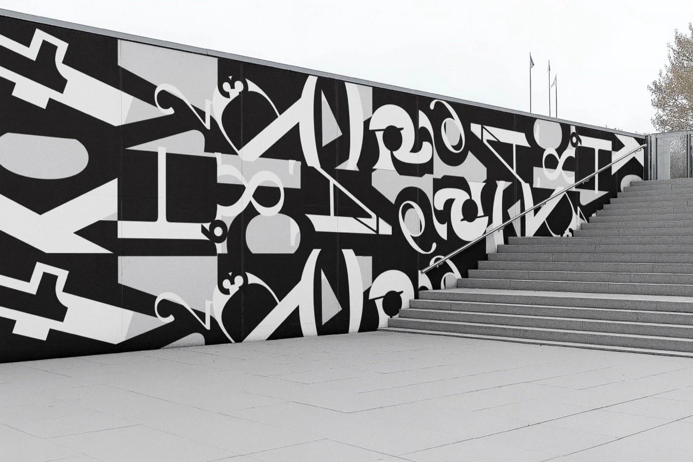
Rhythmic Pattern 1
-
![]()
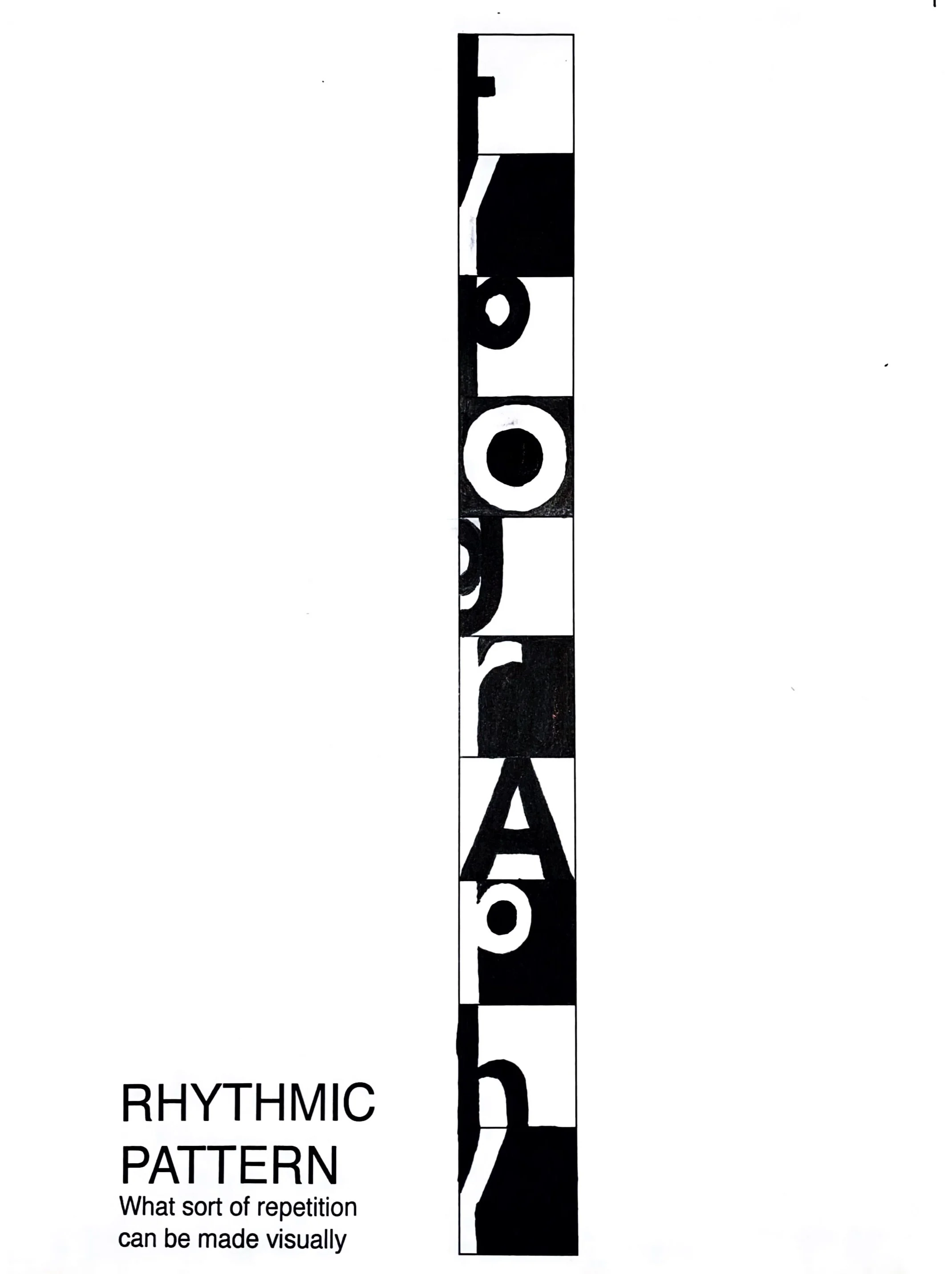
Rhythmic Pattern 2
-
![]()
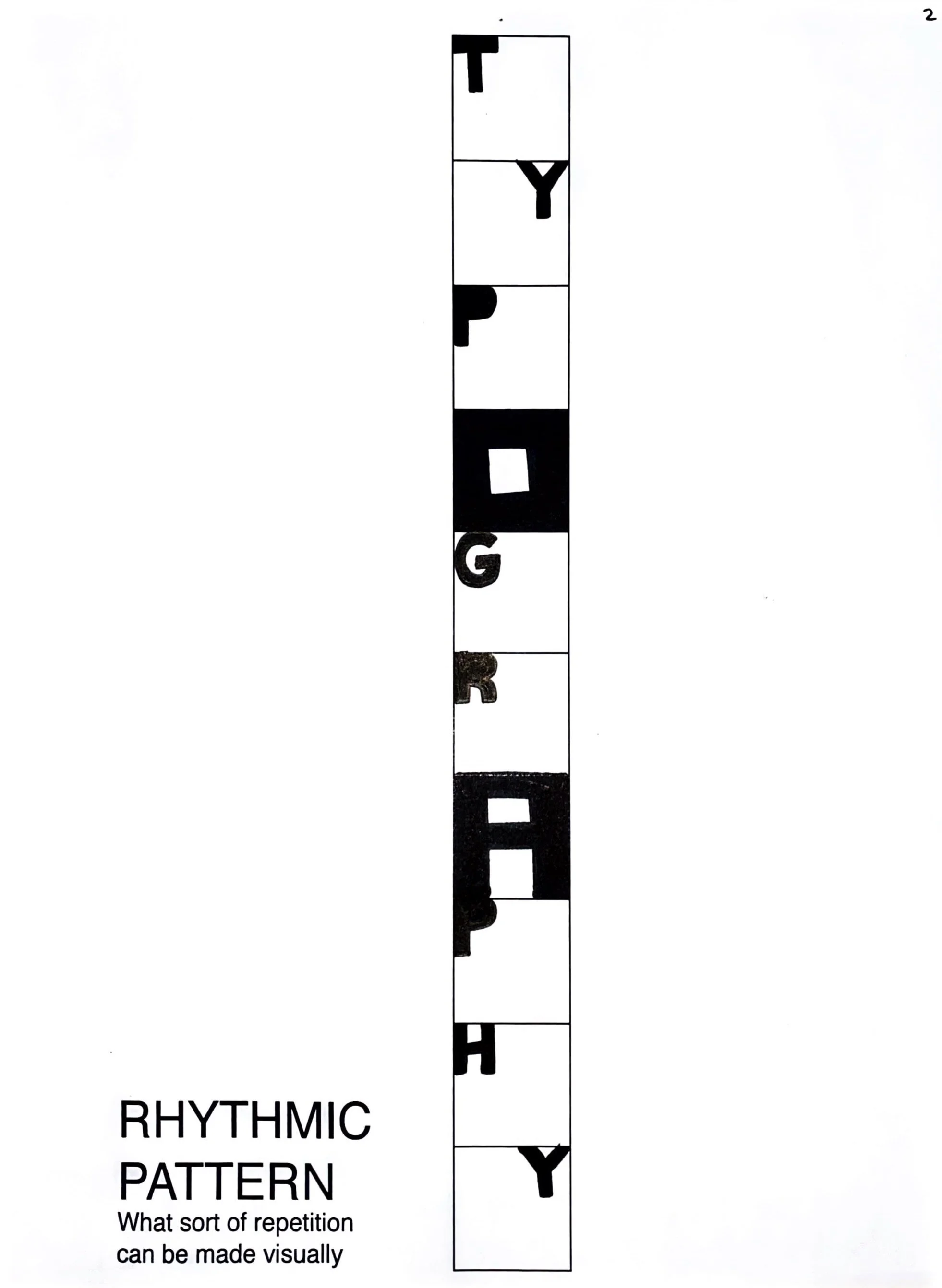
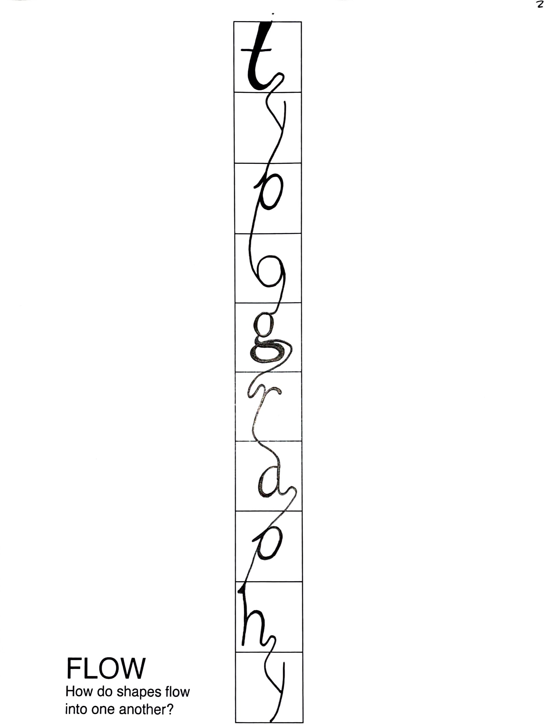
Flow 1
-
![]()
Flow 2
-
![]()
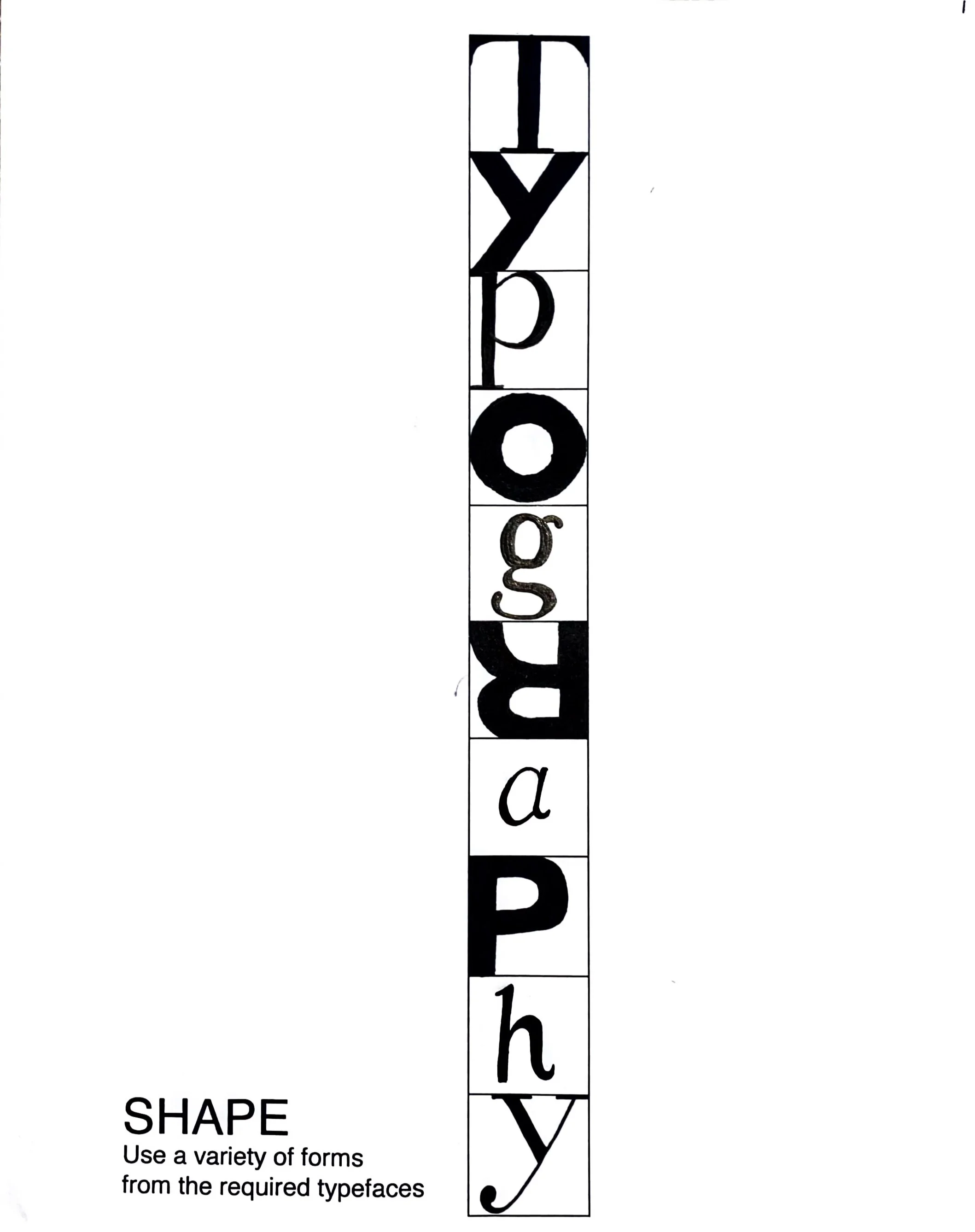
Shape 1
-
![]()
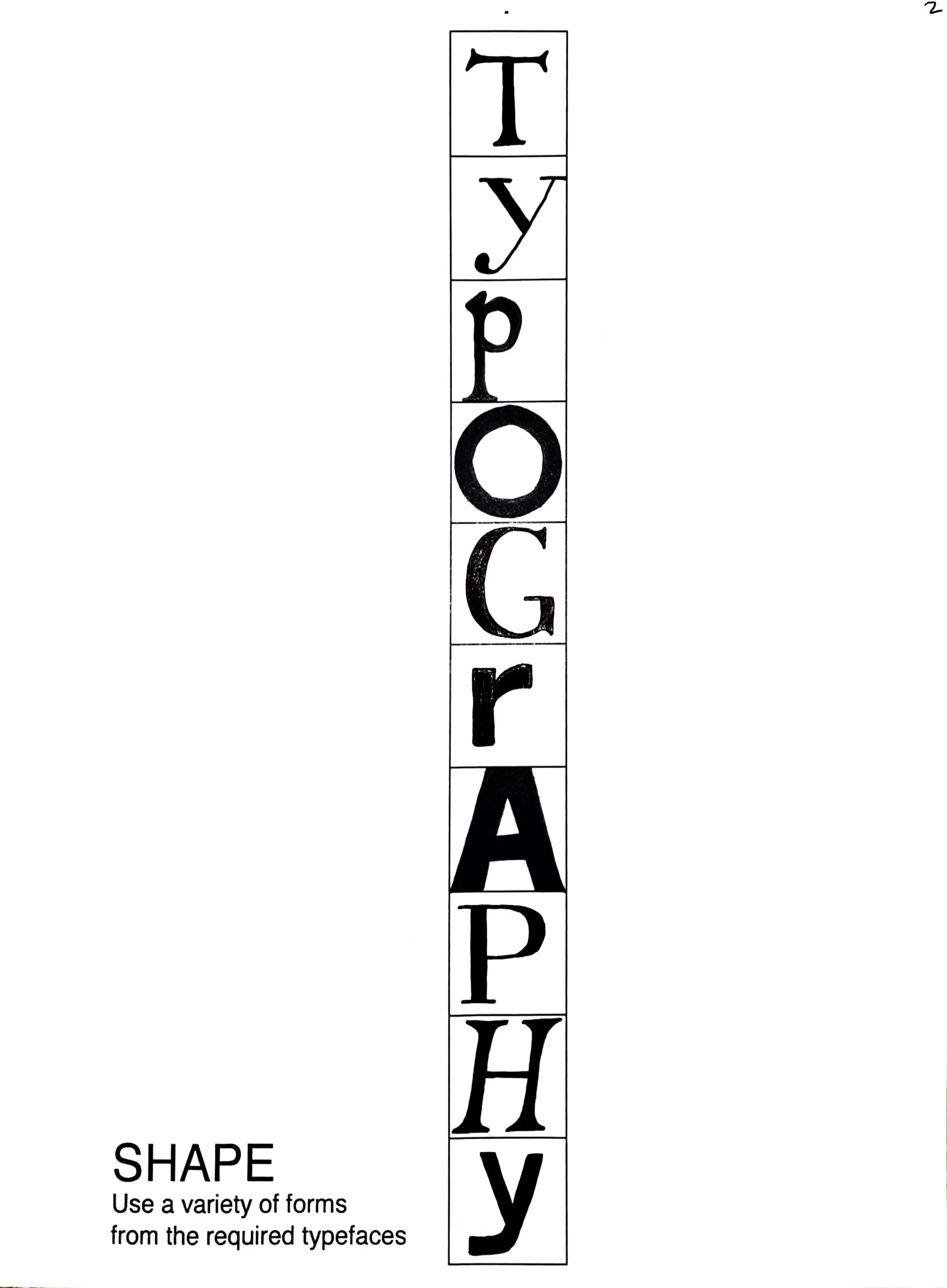
Shape 2
-
![]()
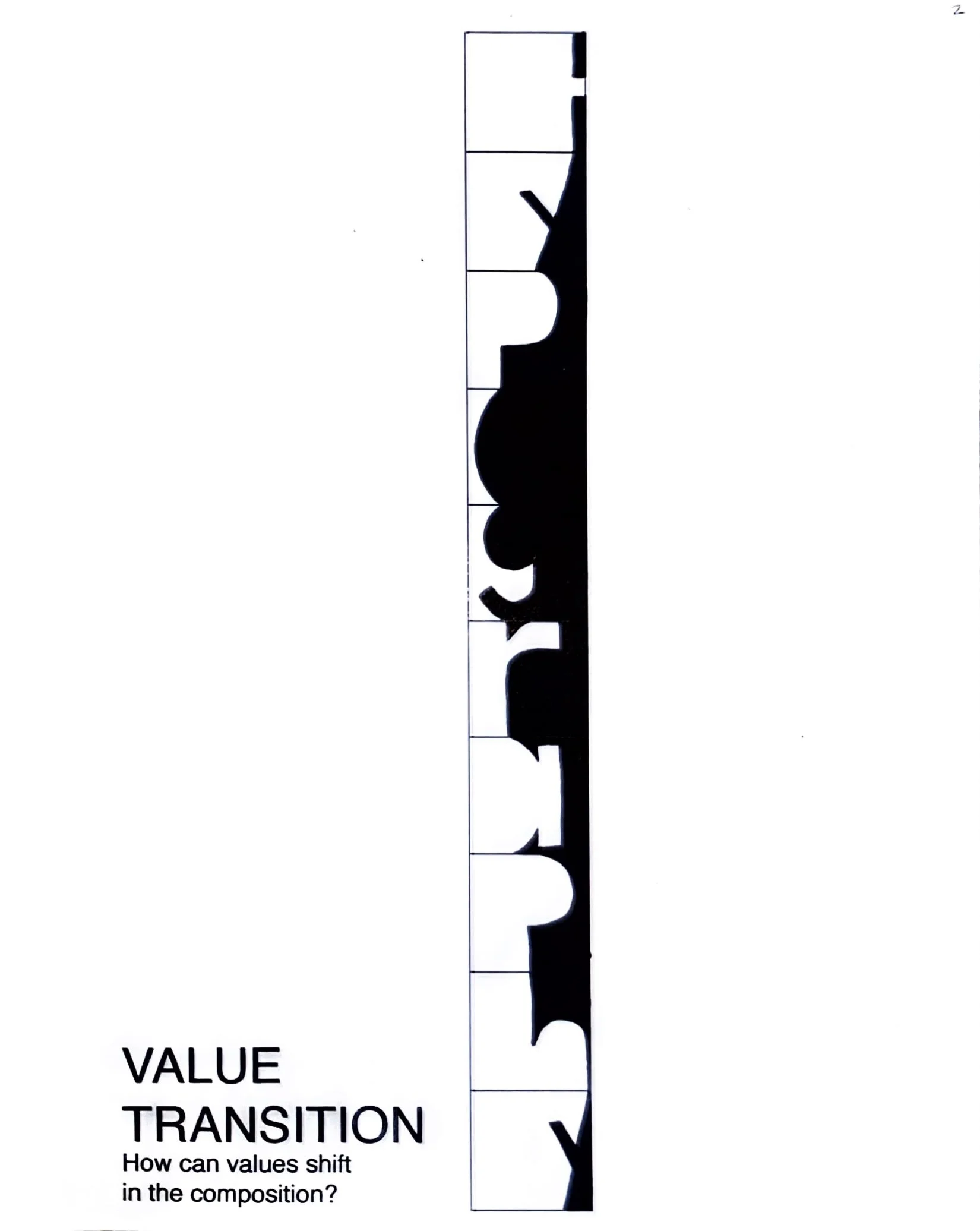
Value Transition 1
-
![]()
Value Transition 2
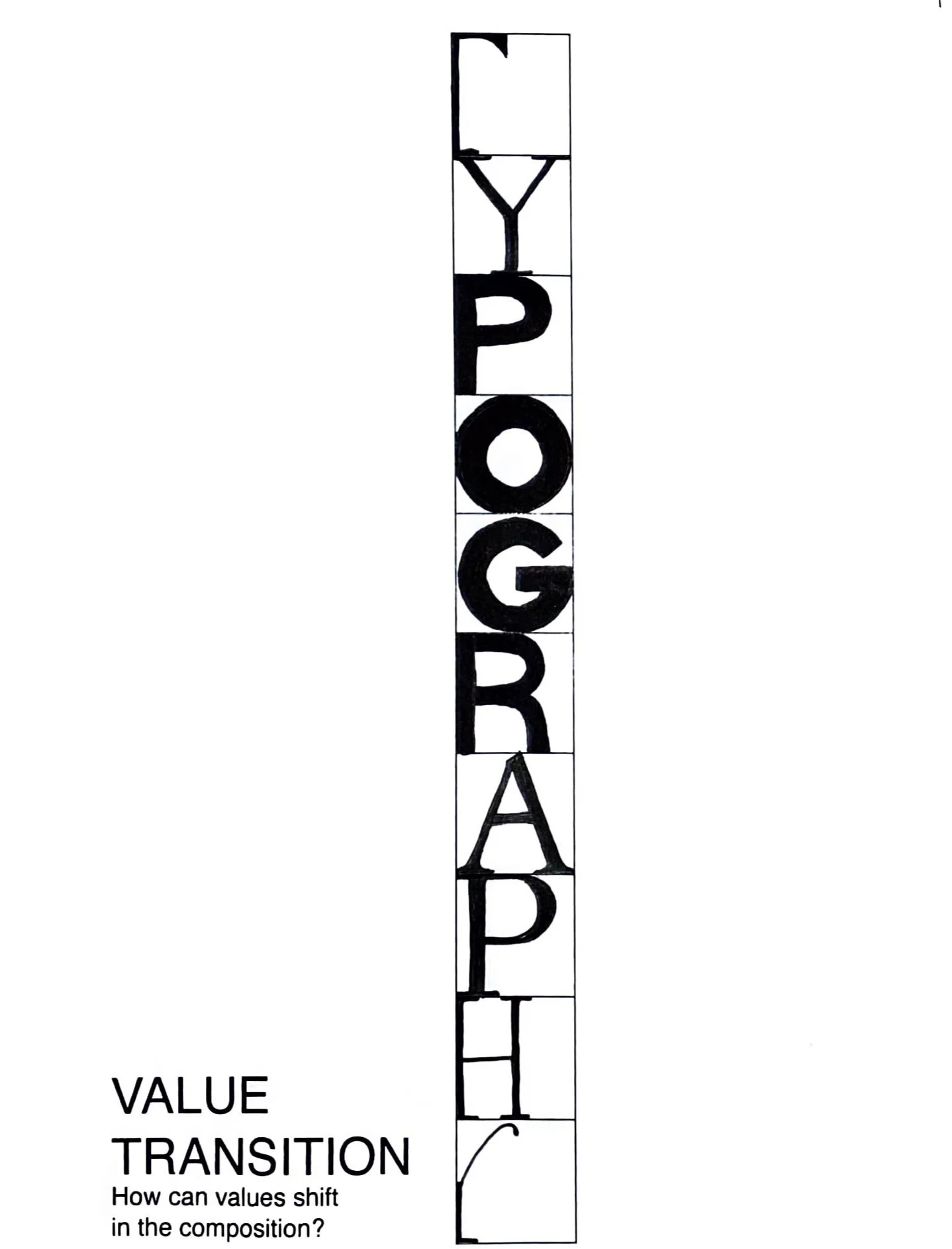


Overall the project was an enjoyable challenge. I found myself going back and forth on the decision to have it more readable or feed into the idea of just working with the shapes to create something interesting. I ended up keeping the letters pretty stagnant which I am conflicted by. Only having two letters at angles seems off balance making me wish I added more variety. The moments of flow in my project seem most successful to me, especially the transition between G, R, and A. My attention to turning sharp points into curves with other letters makes it feel less abrupt, despite the harsh black and white background lines.
My biggest struggle with the project would be the execution of the physical final. Printing with a partner, we had troubles with the crop lines while merging documents to print. I ended up having to cut my final product without croplines making me guess which background boxes were within required measurements. Folding ended up being difficult to keep neat, there a couple of tear marks in my folds from too much pressure but I made sure to be extra careful to not smear the ink. After this project my main focus of improvement for the next will be quality of my final printed piece of work.